15 UX design guidelines for your eCommerce according to Baymard Institute

User Experience (UX), is essential in eCommerce, as it can make the difference between a customer completing a purchase or leaving a website.
What is UX design?
UX design refers to the process of designing products, systems, or digital interfaces with the aim of providing users with a positive and meaningful experience when interacting with them.
The primary focus of UX design is to understand the needs, expectations, and desires of the users to create products that are useful, accessible, and enjoyable to use.
Why include UX design in your eCommerce?
To start with, UX directly impacts the conversion of visitors to customers. Intuitive navigation, appealing design, and a seamless shopping experience significantly increase the likelihood of users completing their transactions, resulting in increased revenue.
Customer retention is also closely linked to UX. A positive experience not only attracts new customers but also retains existing ones. Satisfied customers are more likely to return and make additional purchases, thereby contributing to the sustainable growth of eCommerce over time.
Shopping cart abandonment is a common issue in eCommerce, but good UX can help reduce this rate. When users encounter obstacles or complications in the purchase process, they are more likely to abandon their carts before finalizing the transaction.
Therefore, an optimized user experience can have a direct positive impact on conversion rates and sales.
Trust is another critical factor. Users need to feel secure when providing personal and financial information online. A design that conveys security, coupled with privacy policies and secure payment options, helps build trust in visitors, which can translate to higher visitor-to-customer conversion.
In a competitive market, UX is key.
An eCommerce site that stands out for its ease of use and convenience can win consumers' preference over competitors. Moreover, the brand's reputation is closely related to the quality of experience it offers to users. A positive UX improves brand perception and promotes positive word of mouth, which can boost visibility and customer loyalty.
Accessibility is also an important aspect of UX. Ensuring the site is accessible to all people, including those with disabilities, broadens the customer base and complies with legal regulations, reflecting a genuine commitment to inclusion.
Baymard Institute
Baymard Institute is a research and consulting organization specialized in enhancing online user experience, especially in the realm of eCommerce. Founded in 2009, Baymard Institute is committed to researching and analyzing best practices for eCommerce website design, as well as assessing the usability and effectiveness of various online user interfaces.
Its main activities and services offered include:
User Research and Testing: They conduct extensive user tests on leading online stores to identify common issues, user experience obstacles, and opportunities for improvement. This is done through detailed evaluations and thorough analyses.
Reports and Studies: They publish data-based reports and studies offering concrete analyses and recommendations on how to enhance user experience on eCommerce websites. These reports are widely respected in the industry and used as reference resources.
Benchmarks and Comparisons: Baymard Institute compares and ranks top online stores based on their performance in key user experience areas. This provides companies with a benchmark to assess their own performance and compete in the market.
Conferences and Webinars: They organize conferences and webinars to share their findings and insights with eCommerce professionals, web designers, and others interested in improving their UX.
Consulting and Advisory: They offer tailored consulting services to help companies implement best UX practices on their eCommerce websites, utilizing the data and research gathered.
Baymard Institute has created a set of guidelines focused on optimizing user experience, currently totaling 680. These are divided by types of industries, platforms, topics, and objectives.
15 Guidelines from Baymard Institute
Here are some of the most relevant guidelines for your eCommerce:
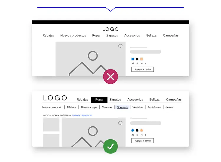
Guideline #300
Highlight in the navbar the selection where the user is located.
For customers, it's important to know which section of your eCommerce they are in, especially if they landed directly on a product page from an external link.
When users don't know where they are within your site, they have less information to decide where to go next. This makes them feel lost and decreases their confidence to navigate.
Using graphic elements such as color blocks, highlight lines, or typography changes in the main menu will help your customers quickly locate themselves in your eCommerce.
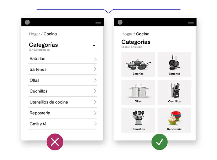
Guideline #309
Use thumbnails to represent the contents of subcategories.
Visual aids enhance the search experience for your users. People tend to get confused with subcategories that are text-only, as a quick glance shows them only jumbled text.
Thumbnails in subcategories help to identify content faster and can be helpful for customers unfamiliar with the product catalog.
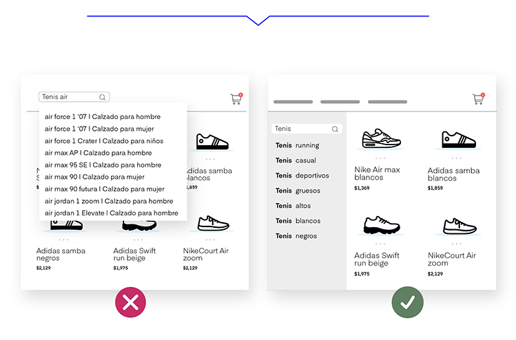
Guideline #356
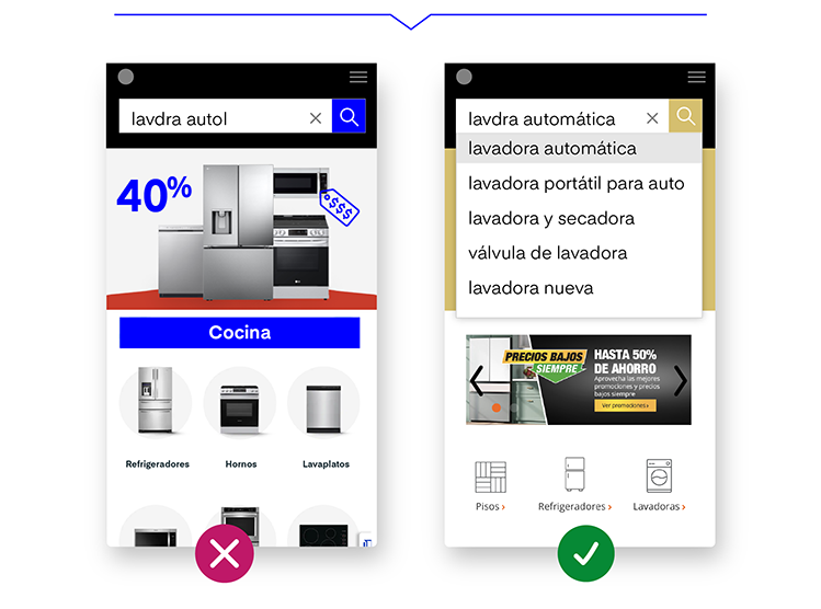
Clearly distinguish between search suggestions and product suggestions.
Search suggestions are word recommendations to complete a user's search. For instance, if the user types "tennis", they could be suggested to search for "running tennis shoes".
On the other hand, product suggestions are recommendations of items in stock that align with what the user is typing. If the user is searching for "tennis", they might be shown different options for this type of product.
UX Research studies have shown that when users use a website's search bar, they expect to receive only search suggestions, not product suggestions. However, it's valid to display both types of suggestions. They just need to be clearly separated through the use of columns, sections, spacing, headers, and thumbnails. published
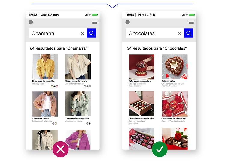
Guideline #394
Consider seasonality in search results for key products relevant to those dates.
Your search engine should have a basic understanding of which products are "in season" so that season-relevant products can be ranked higher.
It makes sense for gifts with chocolates to appear at the top of the results in the days leading up to Valentine's Day. However, if when searching for jackets in winter only lightweight options come up, the user won't know if any of the results are relevant to them.
Guideline #402
Provide relevant filter suggestions based on the user's initial search.
Offer relevant product filters so users can refine their search results and focus on what interests them. It's important that the logic to determine the filters to display considers relevance to the user's search, rather than being based solely on the number of results in specific categories.
For example, when searching for a table, connectivity and type of light bulb filters are not relevant. On the other hand, when searching for boots, features and type of closure are key points for the user.
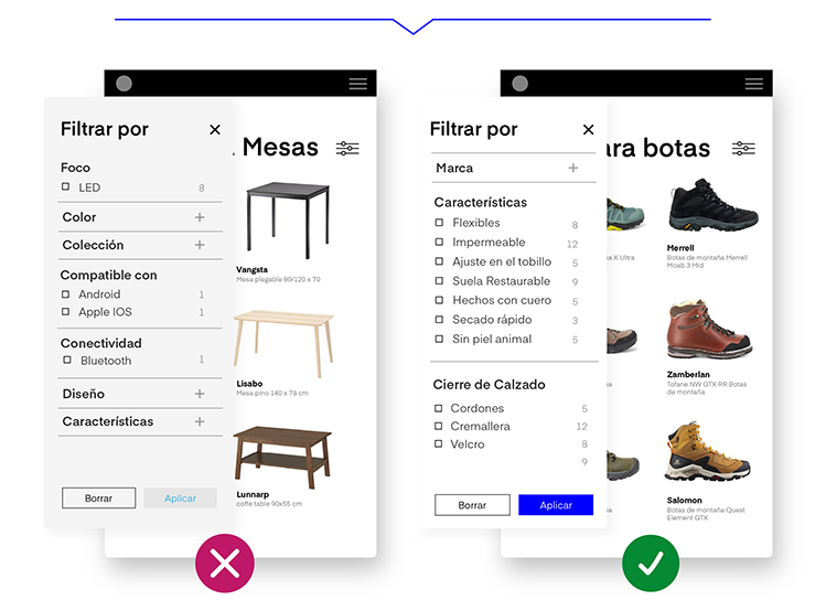
Guideline #409
Always implement filters specific to product categories.
Product filters are key to delivering relevant results to your customers. Many eCommerce platforms have numerous types of products with attributes that are specific only to that type, such as "RAM" for laptops, or "Wheel Size" for bicycles, or "Inches" for televisions.
Without category-specific filters based on these attributes, users will not be able to narrow down product lists to only contain items with suitable specifications, and will have to navigate through lists potentially containing many irrelevant items.
Guideline #510
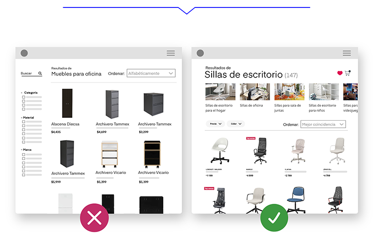
Display the full variety of your products in search results.
The way search results appear on your site affects users' perceptions of your inventory.
Default product rankings, while useful, often do not represent the diversity available in your product catalog.
To display the full variety of products and prevent your customers from leaving, you can:
- Indicate the number of products found (e.g. "Desk Chairs (147)").
- Show different styles, sizes, and colors of the searched product.
- Display categories related to the searched product (e.g. "gaming chairs", "home office chairs", "office chairs", "conference chairs").
- Organize products by relevance.
Guideline #558
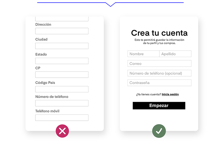
Create a simpler, more comfortable form with only one field for a phone number.
If during the registration process for your eCommerce you request both a landline and a mobile phone number, you can cause confusion. Entering two numbers makes users wonder: What's the difference? Why are two numbers necessary? Is this process worth it? What if I don't have a landline?
Having simpler forms with only one phone number will prevent drop-offs in the process and increase the likelihood of users completing their registration.
Guideline #787
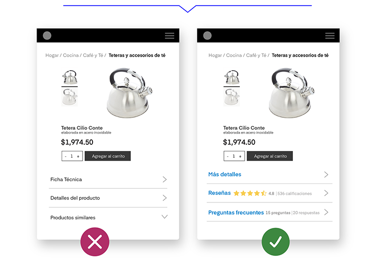
Display reviews and frequently asked questions answered by the brand and other users.
49% of online stores do not include any type of questions and answers, leaving users with one less source of information.
Customers access the questions and answers content for one of two reasons: to get an answer to a specific question or to learn more about the product.
For this reason, users tend to seek product information related to previous experiences with similar products. While reviews are the most popular resource, the questions and answers sections also serve as a valuable tool to address customer queries.
Guideline #852
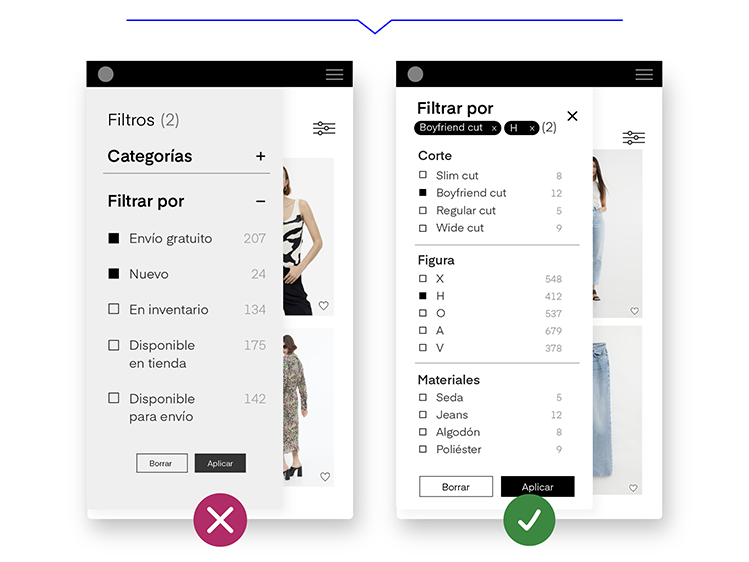
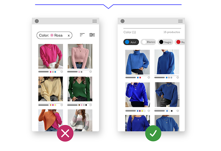
Respect user search filters in search results and product pages.
When users apply filters, like color or size, they expect the list to change to show only the products that match the selected variation. Respecting the filters selected by the user in the search results and product pages will enhance the shopping experience.
A shopper who sees a list of sweaters and clicks on the "pink" filter will expect all items in the list to update to display only pink sweaters. Preselecting a color for a product in the search and then encountering different results can be frustrating.
Guideline #889
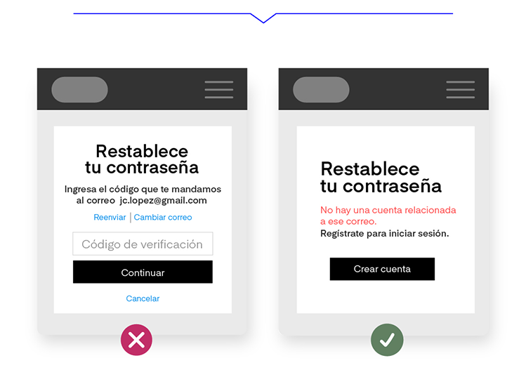
Notify the user if they have an existing account during the password recovery process.
Issues with resetting a user's account password result in an average abandonment rate of 18.75%. In some cases, the cause is that the email address is misspelled or an email that isn't registered for that site is used.
To avoid this problem, when users enter an email to reset the password for an account that doesn't exist, design your eCommerce to display a message indicating that there is no account associated with that email address
Guideline #907
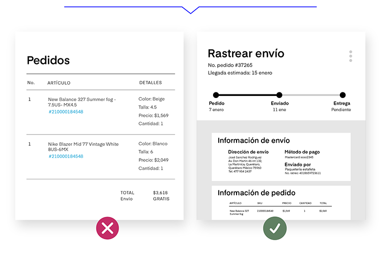
Display tracking, status, and comprehensive shipping information.
52% of eCommerce sites force their users to track their order's shipping on a third-party website.
After a purchase, customers want to easily know the status of their order and the delivery date. This information gives them certainty about when and where they will receive their order.
Guideline #996
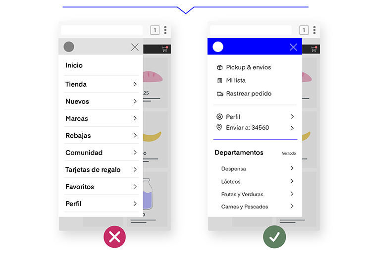
Differentiate between primary and secondary categories through design in the mobile device menu.
A common mistake in mobile design is giving the same visual weight to all categories in the menu as might be done on the desktop site.
Users perceive this list as a heap of text rather than defined categories.
Implement design changes such as separation lines, icons, the use of bold, and different font sizes to give greater emphasis to the categories that are most important to your user.
Guideline #1001
Offer autocomplete suggestions for search terms and queries with spelling errors. In cases of errors or typos, an eCommerce search engine should display results for queries with spelling mistakes. Autocomplete plays a key role in searches.
Unexpected suggestions due to minor errors can make users change their product search strategies or, in the worst case, leave the site thinking it doesn't have what they are looking for.
Depending on the search engine and the implementation of the autocomplete tool, it is highly recommended to oversee search logs. This helps to understand users' misspelled queries and prioritize improvement efforts for autocomplete suggestions.
Guideline #2151
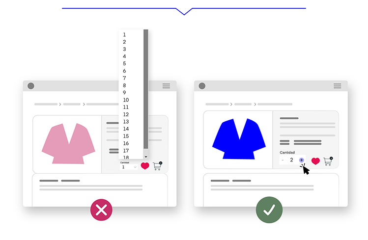
Use buttons or open text fields to add or remove products.
Modifying the number of items in the cart should be a simple and straightforward task. Text fields and drop-down quantity selectors are prone to errors and can slow down the user's cart updating process.
For this reason, it's recommended to use buttons or a hybrid between a text field and buttons to update cart quantities. The cart and order summary should update immediately after the user changes the quantity so they can see the products and the total cost of their order.
In short, UX design is essential for an eCommerce because it directly impacts conversion, customer retention, brand reputation, and market competitiveness. Providing users with a smooth and pleasant experience is key to the long-term success of any online store. Are you ready to implement it?