The 10 Usability Heuristics in Interface Design
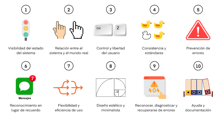
- Jakob Nielsen's 10 Heuristics
- 1. Visibility of system status
- 2. Match between system and the real world
- 3. User control and freedom
- 4. Consistency and standards
- 5. Error prevention
- 6. Recognition rather than recall
- 7. Flexibility and efficiency of use
- 8. Aesthetic and minimalist design
- 9. Help users recognize, diagnose, and recover from errors
- 10. Ayuda y documentación
The big challenge that UX designers face every day is to create simple, intuitive, and accessible experiences that connect with our customers, which is not an easy task.
It's normal to make hundreds of mistakes in the process of developing a good user experience, as there is no manual that tells us exactly what to do to design enjoyable experiences for people. Especially considering that each product, company, client, and industry is different. There is no magic solution for everyone.
However, there are guidelines that help us make better design decisions and build better digital products. One of the most important foundations in experience design are Jakob Nielsen's 10 heuristics, which have become the commandments that every designer should follow.
Jakob Nielsen's 10 Heuristics
In 1995, Jakob Nielsen and Rolf Molich proposed ten rules for developing user interfaces. They created these heuristics through observations and experience gained over years of work.
The heuristics are general rules that you can follow to create more accessible and user-friendly digital products. When you feel lost and uncertain about making a good design decision for your product or service, you can always refer back to these foundations.
1. Visibility of system status
The first principle is about keeping users informed about their actions and what is happening in a given interaction.
When users are informed about the current state of the system, they learn the results of their past interactions, so they can better determine what their next steps will be. Remember: when a design is predictable, it generates confidence in the product.
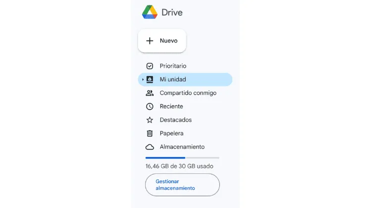
Example 1: Google Drive shows you the available space you have in your cloud.
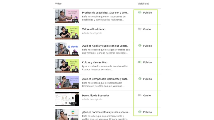
Example 2: On your YouTube channel, you can see which videos are public and which are hidden.
2. Match between system and the real world
It's logical to think that design should speak the same language as users, so words and concepts that are familiar to the user should be used, making the information have a logical and natural order.
When the design follows real-world conventions, users interpret, learn, and remember how the interface works more easily.
It's about making sure that users understand the information without needing to look up the meaning. With that in mind, always use icons and other illustrations that resonate with the real world, so users can recognize and instantly understand what you're trying to say.
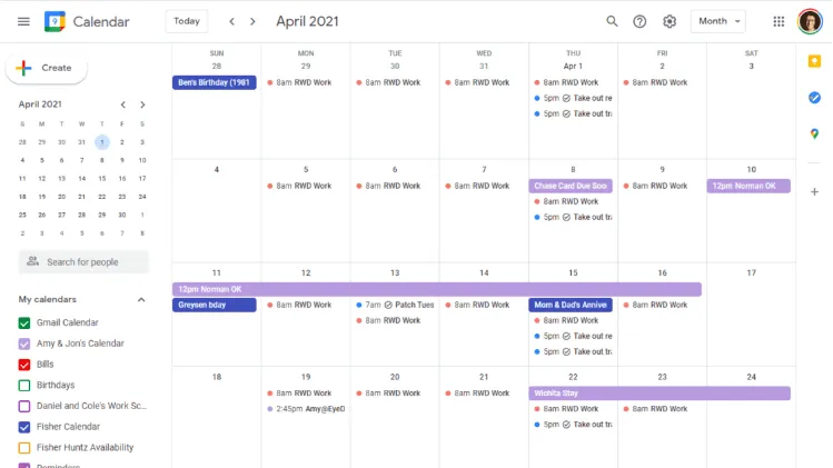
Example 1: Google Calendar follows the design of traditional calendars.

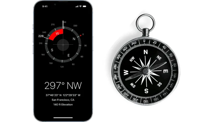
Example 2: The iPhone compass looks a lot like the real compasses used by explorers.
3. User control and freedom
Users often perform actions by mistake. They need a clearly marked "emergency exit" to exit the unwanted action without having to go through a prolonged process.
When it's easy for people to reverse a process or undo an action, it encourages a sense of freedom and confidence. Exits allow users to maintain control of the system and avoid getting stuck and feeling frustrated.
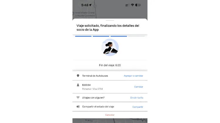
Example 1: When you request an Uber, you have the option to "Cancel" the trip if you feel the driver is taking too long or if you regret requesting it.
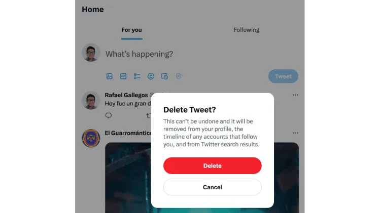
Example 2: When you wrote a Tweet that you regret, you have the option to delete it.
4. Consistency and standards
Nielsen's heuristics establish that most of the time people use digital products different from yours, so their expectations are based on those products. Users should not wonder if different situations or actions mean the same thing.
Following established industry conventions can help user or customer learning.
Not maintaining consistency can increase users' cognitive load by forcing them to learn something new.
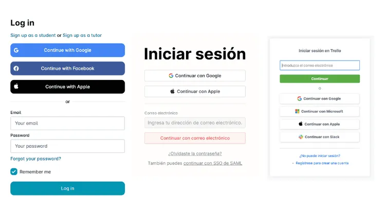
Example 1: Websites have a very similar process for logging in, whether it's by email and password or through a social network.
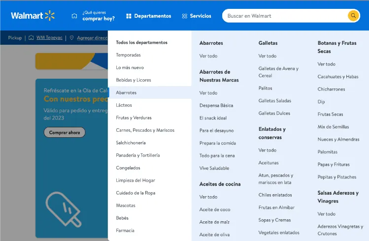
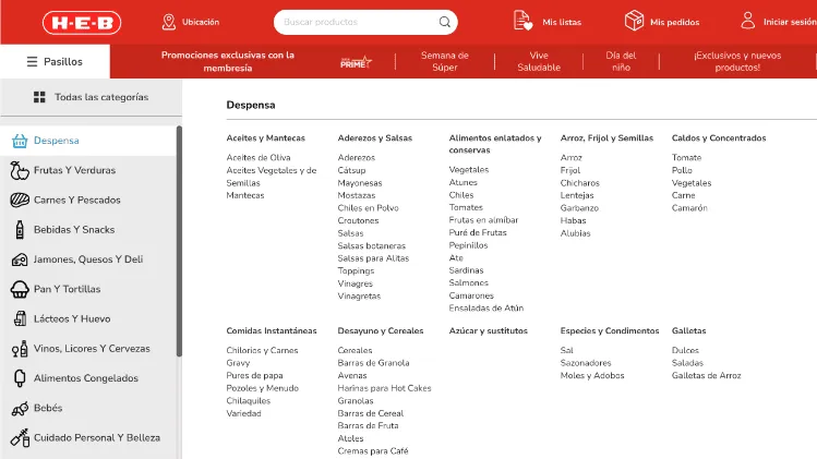
Example 2: Most online stores have a categories section that allows users to search for products more quickly.
5. Error prevention
Sometimes errors will be inevitable, so a message is important, but we should always try to prevent such problems or errors. We must eliminate conditions that are prone to error.
According to Nielsen's method, there are two types of errors: slips and mistakes. We understand a slip as an unconscious error caused by a lack of attention.
Mistakes are conscious and based on a mismatch between the user's mental model and the created design. We must prioritize our effort on high-cost errors and then on possible frustrations.
Think of a button to delete files, for example. We should assume that users may accidentally click on this button or may imagine a different outcome. In this way, to prevent the user from being frustrated if they delete files by mistake, it's essential to create a warning message to confirm the decision before proceeding.
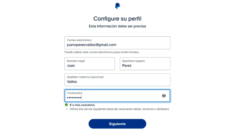
Example 1: When you open an account on PayPal, it tells you the guidelines for creating a password within its platform, saving the user time from creating an invalid password and having to select another one.
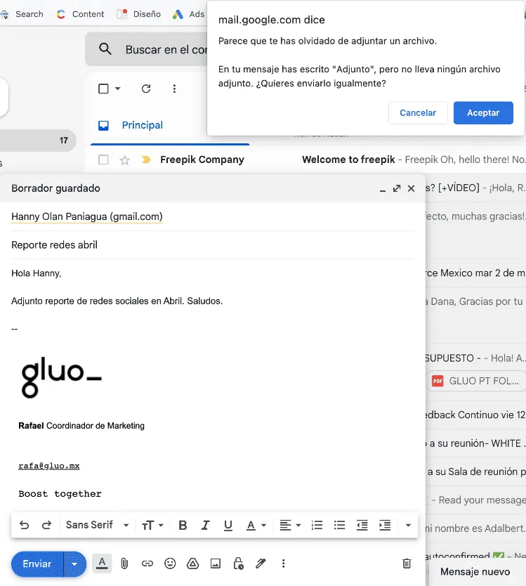
Example 2: Gmail displays a notice when it detects that you wrote the words "Attach a file" in the body of your email and forgot to attach files, to prevent you from making this classic error.
6. Recognition rather than recall
For any user, having to remember a process can be a problem. We must avoid memory load by making elements and actions visible. Necessary information, such as field labels or the menu, should be visible.
If we reduce the information that a user has to remember, we will make their task much easier.
Minimize the user's memory load by making elements, actions, and options visible. The user should not have to remember information from one part of the interface to another.
The information required to use the design (such as field labels or menu items) should be visible or easily retrievable when needed.
Humans have limited short-term memories. Interfaces that promote recognition reduce the amount of cognitive effort required by users.
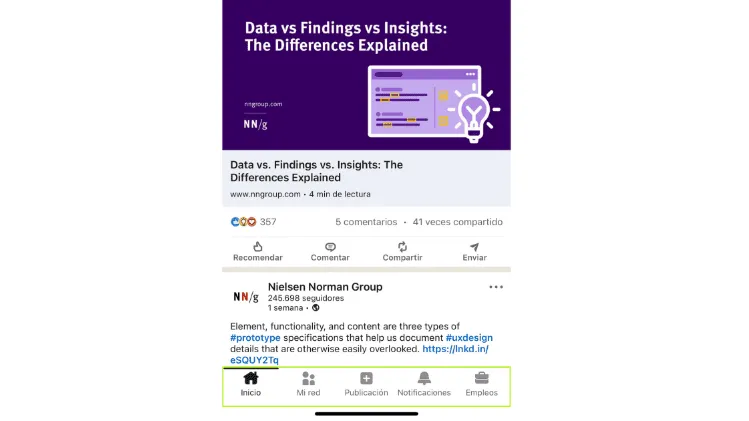
Example 1: In the bottom menu of the LinkedIn mobile app, there are buttons with icons and texts so that the user can quickly perform the desired action.
Example 2: Home Depot displays product categories with icons so that the user can quickly identify the section they want to go to.
7. Flexibility and efficiency of use
Your designs should benefit both experienced and inexperienced users. Keep in mind that inexperienced users need more detailed information. But as they continue to use a product, they become experienced users. Thus, allowing them to customize processes such as creating keyboard shortcuts is a good practice.
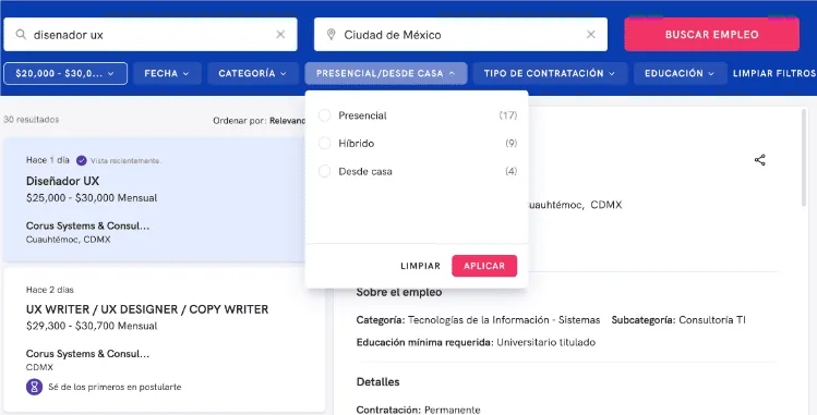
Example 1: The OCC Mundial job search engine allows users to search for jobs by just entering a job title and location. Additionally, if a user wants to perform a more advanced search, they can filter job postings by salary, posting date, or required education level.

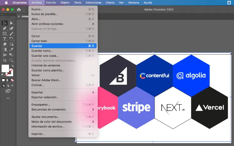
Example 2: In Illustrator, you can save changes to your design by going to the "File" menu and clicking "Save", but experienced users can simply type "Command + S" to save themselves several steps.
8. Aesthetic and minimalist design
It's true, the aesthetic of your application is essential to capture the attention of users.
No one likes to use a product that looks ugly, so you must build products that are visually pleasing to your customer.
However, do not consider aesthetics above functionality. Aesthetics and function are equally relevant.
Create simple interactions that contain only essential information. Avoid unnecessary visual elements that can overwhelm and distract users.
Remember, each additional element will compete with relevant and indispensable data and divert attention from what's essential.
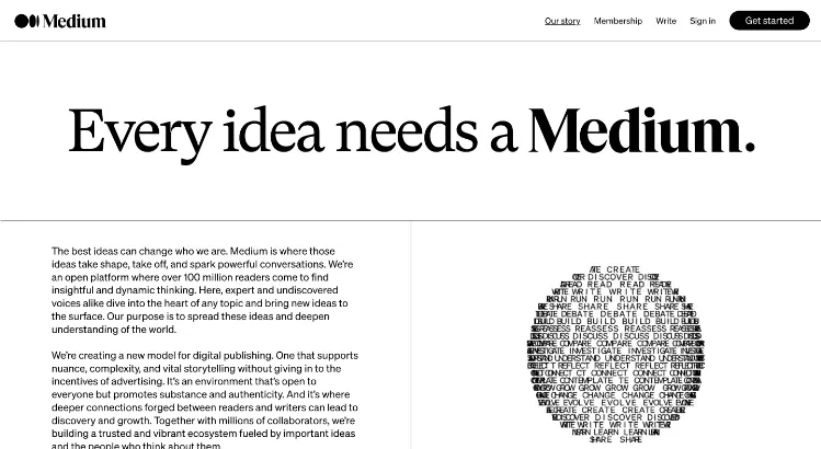
Example 1: Medium, an open platform for reading and writing articles, has a sleek and simple design that does not use extravagant or unnecessary elements.
Example 2: Mailchimp, an email marketing tool, follows a minimalist design with short texts and simple images.

9. Help users recognize, diagnose, and recover from errors
Error messages should be expressed in simple language (without error codes), accurately indicate the problem, and suggest a constructive solution.
These error messages should also be presented with visual treatments that help users notice and recognize them.
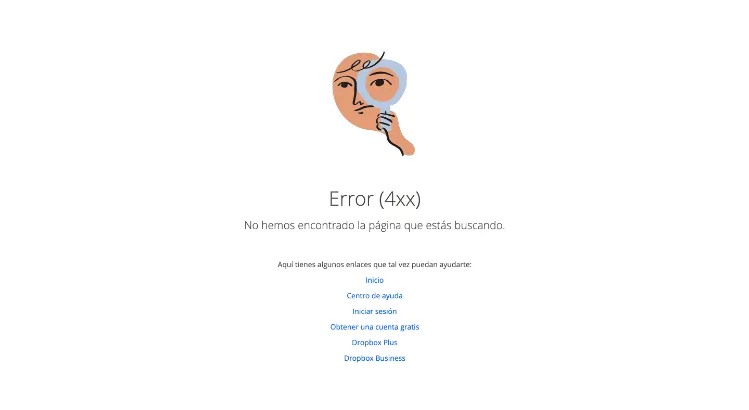
Example 1: 404 pages are the most common way to communicate to the user that the page they are trying to visit does not exist or has been deleted. If your user lands on a non-existent URL, it's important to provide them with options to continue navigating within your site.
Example 2: When you are about to delete photos from an iPhone, a notification pops up warning you about the number of photos you are about to delete and gives you the opportunity to cancel the action.

10. Ayuda y documentación
The last of Nielsen's heuristics refers to documentation that will help users understand how to perform their tasks.
Although all the heuristics listed above are supposed to help users avoid errors and facilitate navigation without assistance, it is still essential to provide additional assistance at any time.
Therefore, always provide help documentation that is easy to search for and focused on users' tasks. A good practice is to list the concrete steps that users can follow to successfully complete a task.
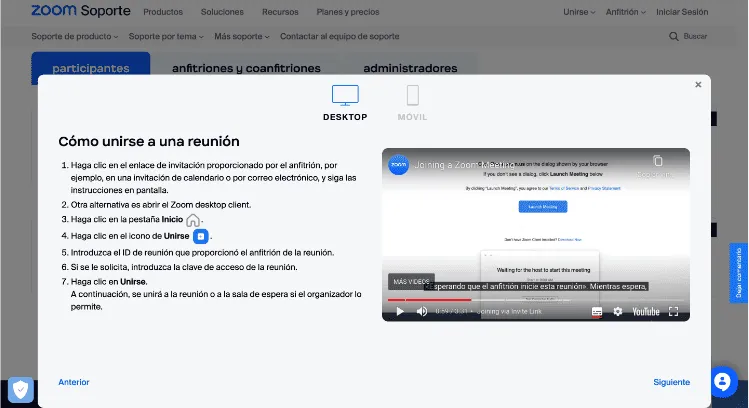
Example 1: Zoom has an extensive support library. Here users can learn everything from how to join a Zoom meeting to how to conduct a webinar. It includes articles, step-by-step instructions, and videos to help its users.
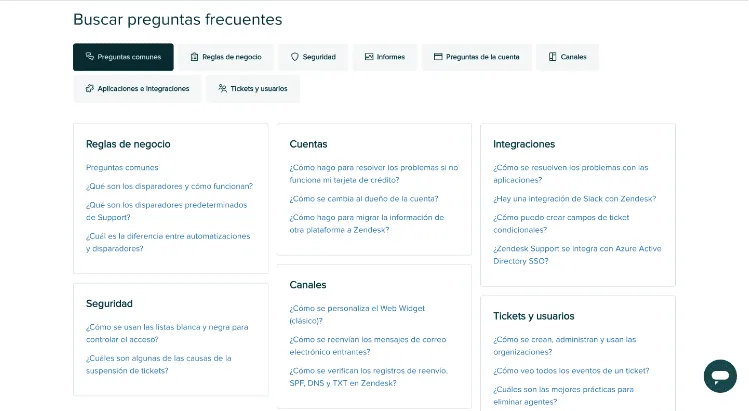
Example 2: Zendesk has a frequently asked questions (FAQ) section to address questions about business rules, accounts, security, or user tickets.
INTUITIVE AND EASY-TO-UNDERSTAND DESIGN
Nielsen's heuristics are essential for UX and will help you design a better experience for your users.
The ideal scenario is to work with the heuristics in mind from the beginning of a project to avoid future adjustments.
An intuitive design that has a minimalist approach and is easy to understand attracts users both online and in the physical world.
By following Nielsen and Molich's 10 heuristics, designers can create user-friendly, accessible, and intuitive products.


