What are heatmaps in UX and what are they used for?
Heatmaps are a visual representation of how users interact with a website or application. Through these tools, we can determine which parts of our site users click, scroll, move the mouse, and pause to view content.
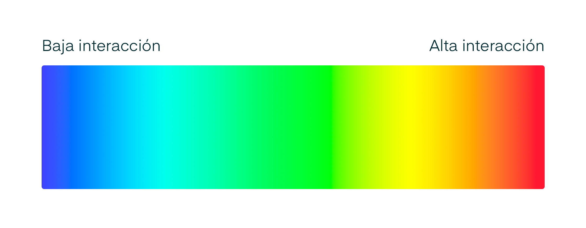
They typically use color gradients ranging from warm colors like yellow and orange to cooler colors like green and blue to identify the areas where users interact.
Heatmaps reveal the most used and viewed parts by users, and they also show which sections or elements receive the least interaction.
This way, you can optimize those elements of your application that simply don't work well for user experience and identify the areas that do make sense for your visitors.
History of heatmaps
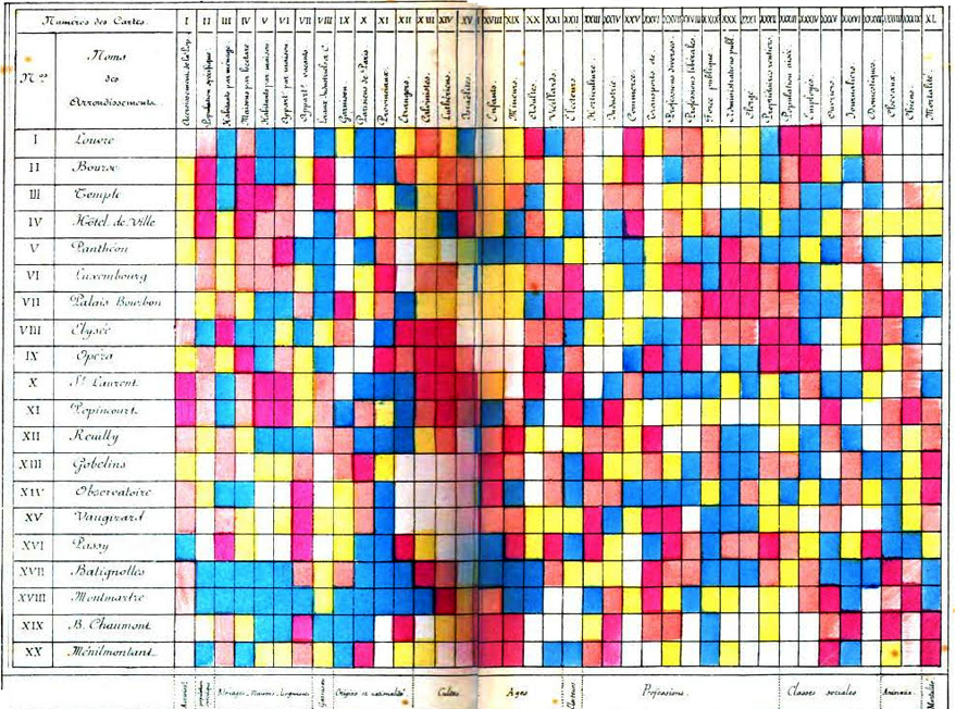
Heatmaps are believed to have originated in the 19th century when manual shading in grayscale was used to represent data patterns in matrices and tables.
The term heatmap as we know it now was officially registered as a trademark in the early 1990s when software designer Cormac Kinney created a tool to graphically display real-time financial market information.
Mapa de calor de densidad de población y sus características (nacionalidad, origen, profesión, edad, clase social, etc.) en Paris por distrito en el siglo 19.
Heatmaps in UX Research
UX Research is the systematic study of users to design digital products that fit their needs.
Basically, it's researching your users to understand their behaviors, needs, and goals in order to design the ideal application for them.
UX professionals have adopted heatmaps as a UX Research methodology to learn how users interact with a website or mobile application.
How heatmaps work
There are different ways to generate heatmaps for a website. However, almost all solutions follow the same process.
They create a copy of your page's HTML code, then categorize each element by its tag, main elements, ID, or classes. When the user views the page, their behavior is collected and all the elements they interacted with are mapped.
There are multiple applications in the market to generate heatmaps that you can install on your website or application. We'll look at some of them below.
How to read a heatmap
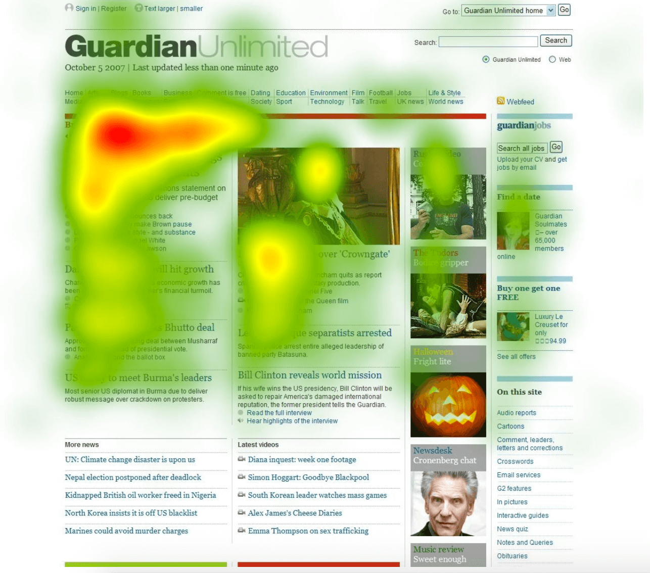
A heatmap tells us through colors which elements users interact with the most on a website or mobile application.
The redder the element or section, the more users have interacted with that element.
The bluer the element or section, the less users have interacted with that element.
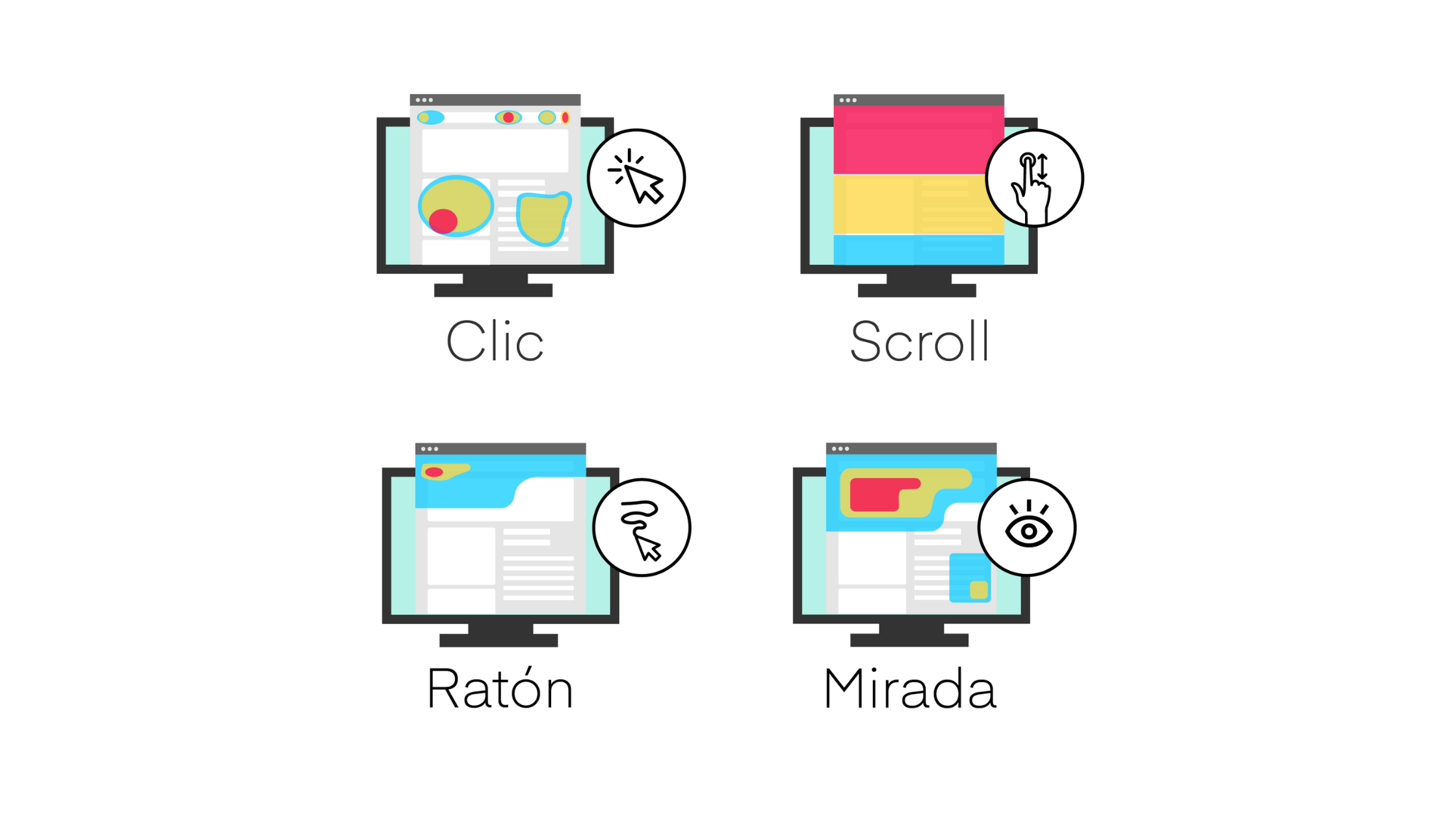
Types of heat maps
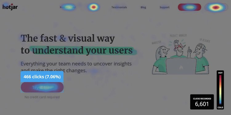
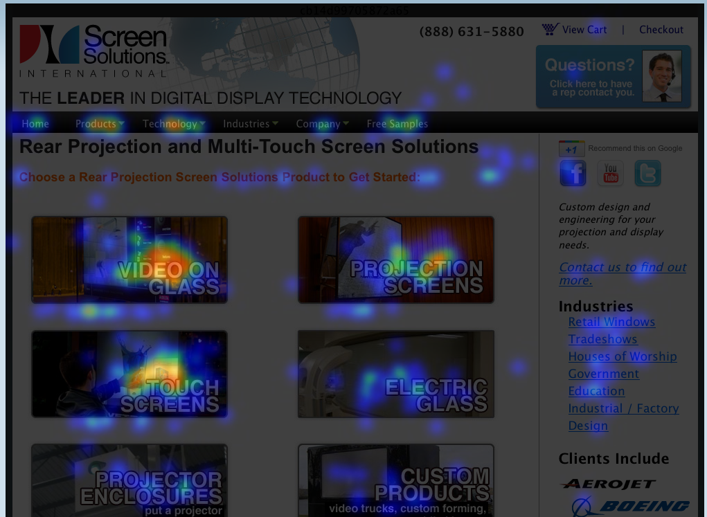
Click heat map
Detects where users click the most. This map helps us understand which links, buttons, or CTAs visitors click on within our application.
Scroll heat map
This type of heat map tracks the areas where users scroll more. In this way, we can know in which sections users scroll and where they stop.
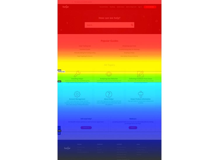
This type of map is especially helpful in determining when a page is too long and boring for the user, as it shows the moment when the user stopped scrolling.
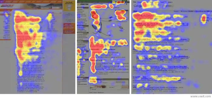
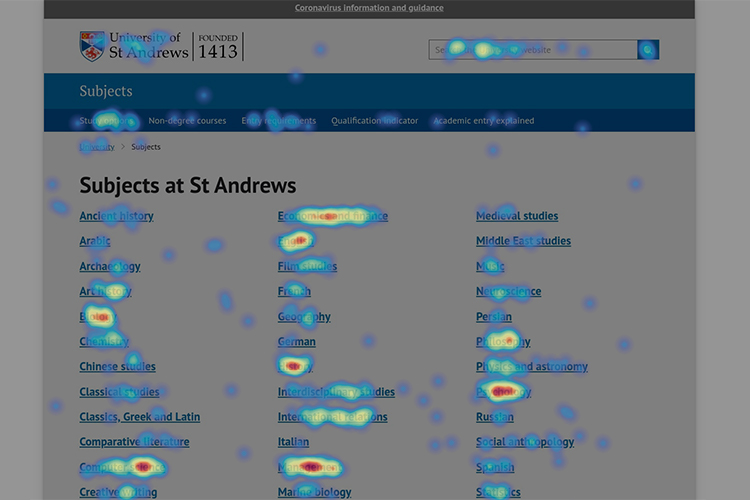
Mouse or movement heat map
This type of heat map identifies the areas where users move their mouse. Mouse tracking is a way to find out which parts the user is reading or where they are primarily focusing their attention. Many users use the mouse to point to their reading and navigate within a site.
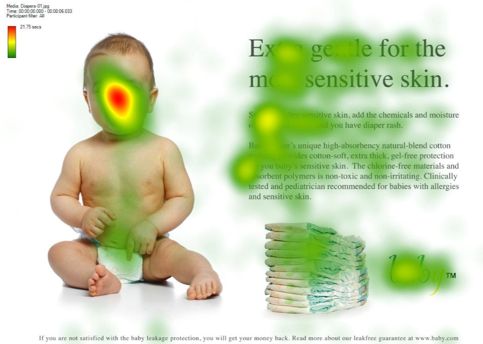
Eye Tracking Heatmap
This type of heat map identifies the sections where users spend more time looking. This helps us understand which parts of the text or images on the site are interesting to the user and which are not.
Advantages of using heat maps
Detect what is not working
Heat maps show us which elements and sections users are not interacting with. They help us identify which elements are rarely seen, clicked, or read by users. Elements that contribute little or nothing to the user experience can be optimized, replaced, or even removed.
For example, if there's a button you want users to click more often, but the heat map shows it's rarely used, you can proceed to create new design proposals for that button. You could make it larger, change its color, move its position, change the copy, or place it in a different section.
Detect what is working
Heat maps not only show us what doesn't work but also what does work. One of the most challenging aspects of UX design is identifying elements and sections that are valuable for the user experience. By knowing which elements users interact with and make sense within the experience, you can decide whether to optimize them further or leave them unchanged.
For example, you might discover that a banner you were unsure about because it "looked ugly" actually works very well, and users frequently stop to view and click on it. In this case, the heat map shows you that the banner works within your platform's experience, and you might not need to make any changes.
Design based on data
A bad practice in web design is making changes to the site without knowing why these changes are being made. Changes are often made because they "look nicer," a manager made the decision, or someone simply designed it that way. However, these justifications are weak and could significantly affect your user experience and conversion rate in the long run.
Remember that no one knows exactly what users want or are looking for. That's why, as much as possible, your site's design should be data-driven.
Improve your metrics
By optimizing, replacing, and removing elements in your platform's design based on user data, you will increase your business's key metrics. Designing an experience based on data will increase registrations, pages viewed per session, click-through rate, and session duration.
Boost your conversion to sales
By optimizing your platform's design using heat map data, you will:
Improve the user experience
Encourage customers to return on their own
Consequently, increase your business's sales.
Tools for creating heatmaps
There are multiple tools available for creating heatmaps within your digital platform. Here we review some of them.
Smartlook
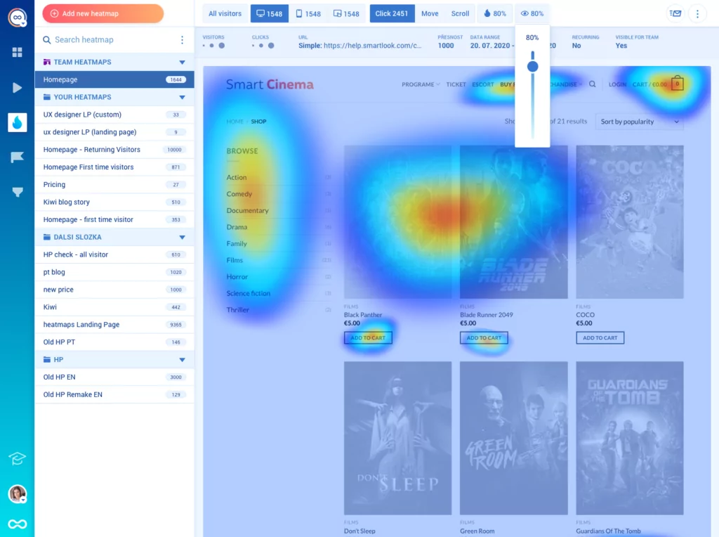
Smartlook is a product analytics and visual user insights platform. It comes with four key features that help you see what your users are doing and discover why they are doing it: heatmaps, session recordings, events, and funnels.
Crazyegg
Crazy Egg es una herramienta de análisis web y optimización de la tasa de conversión (CRO). Ofrece mapas de calor, informes de superposición, grabaciones de usuarios, pruebas A/B y funciones para rastrear el tráfico de anuncios en su sitio web.
Hotjar
Hotjar is a website heatmap tool that also provides session recordings, user feedback widgets, and survey features. It is a beginner-friendly tool suitable for marketers, product managers, and UX professionals.
Lucky Orange
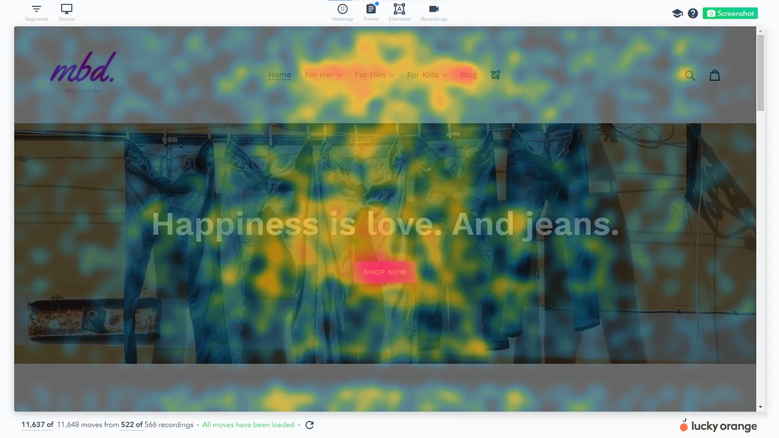
Lucky Orange offers features for both visitor behavior analysis (heatmaps and session recordings) and conversion rate optimization (CRO) (funnels, form analytics, and live chat).
Mouseflow
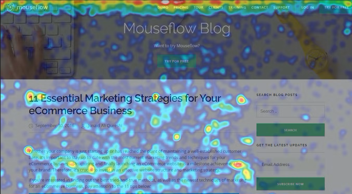
Mouseflow is a website session recording tool that also offers heatmaps, conversion funnels, and more.